
Warran: Original Concept Mobile App
Warran
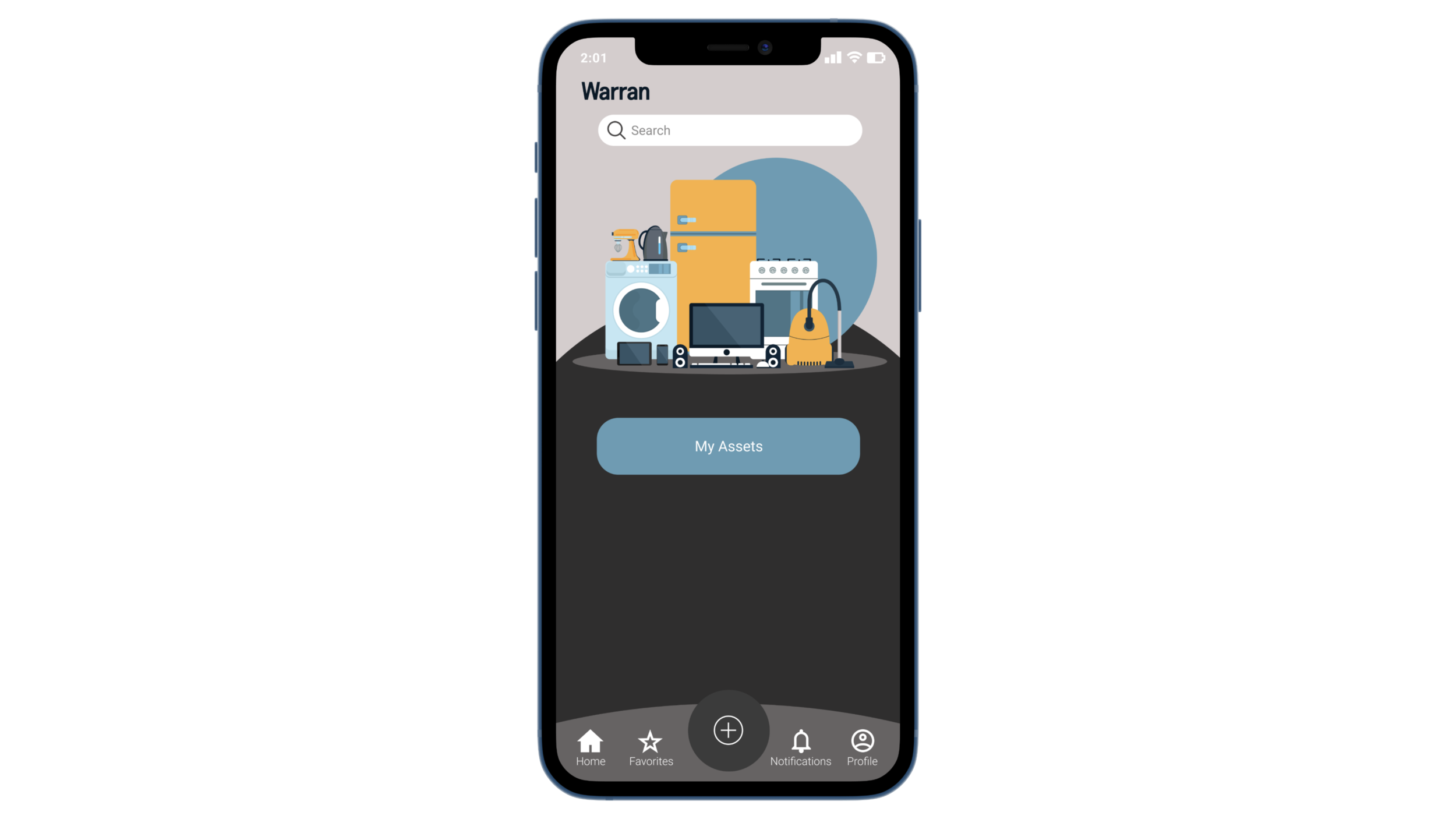
The Simple Tool to Maximize the Lifespan of Your Physical Assets
This app allows users to catalog, view, and maintain their home assets to maximize the lifespan and value of what they own.
Scope and Focus
The management and maintenance of physical assets can be daunting, especially to Millennials and GenZs as they buy cars, technology, and homes. Warran is a tool to capture the details of your physical assets, understand how and when to perform preventive maintenance, and what to do when your assets need professional maintenance. Warran is a single app that unifies your assets, understands your needs, and advises you on the most important aspects of the things you own. See all your stuff–and know how to care for it–all in one place.
Asset management is a category of physical maintenance that often goes overlooked. As Millennials and GenZs become auto and homeowners, understanding the basics of regular maintenance is critical to their quality of life. If an asset goes unmaintained–either through negligence or simple lack of knowledge–its value rapidly declines.
The premise is simple:
1. Every time an asset is purchased (a car, a piece of technology, a home), the details of the asset and any corresponding warranties are entered into Warran.
2. Warran categorizes the asset and activates the preventive maintenance schedule, sending customizable notifications to the user when maintenance is scheduled.
Design Goals and Objectives
The design goals and objectives are to design and end-to-end app that will allow for the management of home-related assets (auto and tech asset management features or standalone apps are potential avenues for future development). The potential features will be fully assessed post-MVP development and are not necessarily inclusive of or limited to the following:
Building a user profile with
Locations assets may be located in
Connected accounts for replenishment of preventive maintenance parts (filters, etc.)
Preferred vendors for repairs
Entering asset information manually
Name
Purchase date
Category
Warranty
Location
Detailed Specifications
Searching for owned assets using these search and filter options:
Location
Category
Purchase date
Warranty expiration date
Projected replacement date
Next preventive maintenance action date
Role
Brand Concept & Exploration
Research
Ideation
Wireframing
Visual Design
Prototyping
Duration
65+ hours
Spring 2021
Tools
Figma
Adobe Illustrator
Research Goals: Survey
1. Identify common home assets and their usage
2. Determine warranty and service plan use for home assets
3. Identify patterns in home maintenance behavior including record-keeping and maintenance scheduling
4. Identify patterns in attitudes towards home maintenance
5. Identify differences based on resident status (homeowner, renter, landlord, etc.)
Survey Outcomes:
40 participants were surveyed about their home assets, active warranties, and service plans.
Participant Breakdown:
77.5% identified as a Homeowner
30% identified as a Renter
2.5% identified as Landlord or Property Manager
Over 80% of participants reported having each of the following assets:
Computer
Television
Washing Machine
Major furniture pieces
Oven
Dryer
Refrigerator

The three top assets that participants had Active Warranties or Service Plans (AW&SPs) for:
Refrigerators
Furnaces
Washing Machines
77% of participants with AW&SPs kept original paper documents
40% answered some version of “No, I’ve never executed a warranty or service plan”

Personas
Developing two user personas, Amelia and Josh, helped cover two of the main archetypes in the user base: the established, organized homeowner/renter and the eager but naive young homeowner/renter.
Ideation
Through multiple rounds of rapid ideation and elaboration, I drew out some of the key components of brand messaging and potential design ideas.
After brainstorming and a bit of brand exploration, I created two versions of a sitemap organizing the three main areas of the app: Assets, Warranties, and Locations.
I also created a simple user/wire flow of the steps and screens a user such as Amelia or Josh would use to add a refrigerator as an asset, enter details, and set a maintenance schedule (based on catered recommendations from the app). Creating this specific wire flow allowed me to start to visualize options for the various screens that would be needed for the user to accomplish their goal.
Brand Vision and Purpose
The name Warran is derived from "warranty," which will be one of the main document types stored in the app. The name also serves to personify the brand (someone helping to create peace of mind) since it is similar to the name Warren. A mood board served to narrow down visual elements that aligned with the brand attributes.
Lo-fi Wireframes
With interaction design principles and flow in mind, I created a first version of wireframes. By focusing on the detailed information that had be communicated within each of the screens, the challenge I attempted to solve was how to maintain simplicity while establishing a way for users to maintain intricate and detailed records.
How could I make it simple to maintain the most mundane information a person has? Warran attempts to integrate simplicity with accountability and, through this, provide a sense of order that brings a deep satisfaction to its users. Because the app has the potential for many screens of lists (boring!), visual hierarchy was top of mind to keep the information organized through headings, subtext, and logical groupings.
Hi-Fidelity Wireframes
Next, I applied the visual design elements to the main screens. Avoiding intricate hues ensured the feel of the app was simple while still being mature. Through simplistic shapes and colors reminiscent of those seen in a physical filing cabinet, I set out to provide a sense of familiarity and structure.
In Version 1 (left), I focused on incorporating the many components in list and form versions. Here, the homepage layout and navigation proved challenging as I attempted to bring the sitemap to life.
In Version 2 (right), I created an improved flow and look by simplifying the options available on screen and moving notifications and the add button to the main navigation. The visual elements from the developing UI kit helped to give the app an updated look. Elevating and separating the list options helped to break up the page give it a more user-friendly appearance.
UI Kit
The visual elements of Warran feature layered neutrals, blue and orange calls-to-action, and line drawings representing the various asset types. These repeating elements are used throughout the design to create a cohesive look from screen-to-screen.
Usability Testing
Test Objectives
Test the overall quality and ease of use of the Warran app through four scenarios for the user flows
Observe any areas of confusion or hesitation
Identify any missing or inconsistent elements based on user experience
Identify areas for further development
Test Background and Scenarios
You are a Warran app user. As a homeowner with two properties, you use it to manage your various home assets and their related warranty info.
Scenario 1: You'd like to order a replacement filter for the fridge in the kitchen of your Main Street House, so you need to find the refrigerator's model number.
Scenario 2: You recall that the fridge was installed on December 21st, so you want to update the installation date.
Scenario 3: You would like to view only your kitchen assets.
Scenario 4: You would like to add to Warran a new water heater that has just been installed in your Main Street House.
Test Findings and App Changes
Several adjustments needed to be made to the screens and prototype functionality after testing. The following changes were made in an effort to improve the user experience:
Added a clicked/pressed state for the “Save” button
Why? Users reported not being able to tell if the information changed because the screen stayed the same after saving.
Changed the #D6CDCD (pink) and #E5E5E5 (gray) buttons on the add menu overlay all to #D6CDCD
But why? Users either questioned the slight color difference between the buttons or thought the gray buttons were disabled. Making all three buttons the same color gives a more uniform look to menu and reduces that hesitation or doubt.
Changed the individual form fields to blocks of similar asset details and un-rounded the edges of the blocks in list view
How come? This helps to visually break up the information as the user scrolls down the page and gives the app a cleaner look overall.
Final Screens and Prototype
The final prototype achieves the design goal of allowing users to catalog, view, and maintain their home assets through a user-friendly interface.
Takeaways
The main takeaway of this project was the power of iterative design. Even with a clear idea of the design direction after ideation, being open to consistent feedback and iteration was key. In this project, I found that an early design idea turned out to be way too on-the-nose once applied, and it did not translate to users as expected. Being willing to revisit the design again and again proved worthwhile; even at the conclusion of the project there are ways in which more ideation and iteration will help this project move to its next phase. As far as the overall concept and design of Warran goes, it is clear that the feeling of being in control of the information brings users a feeling of power about the things they own and need to maintain. This may be the fullest sense of “adulting” and one of the most reliable tools the app provides users.